")
")


Introducing: The “Romance, Bold, and Movement” Styling Mat
(Launching Tuesday, October 21, 9 am EST!)
Photographs and styling by Rachel Clarke of Clarke Narrative
First, do you remember that moodboard that was created from the blog post where you can see how to make a mood board? Well, in this blog post, you will see the results from it!
A double-sided mat made for the bold, romantic, and creative storyteller.
When I asked what kind of styling mat you wanted this season, so many of you said the same thing:“Something bold for winter… but still neutral enough to use all year.”
And that’s exactly what I created.
This mat, brought about by three words: Romance, Bold, and Movement, is my response to all the survey responses! It’s for the photographers and stylists who love depth, texture, and emotion in their images. It’s for those who aren’t afraid of color, but still crave balance and versatility.
Photographs and styling by Rachel Clarke of Clarke Narrative
The Inspiration: Bold, Romantic, and Full of Movement
When I started dreaming up this mat, I wanted to capture that feeling of bold, but also classic — the kind that draws your eye in and gives your photo movement, even in stillness.
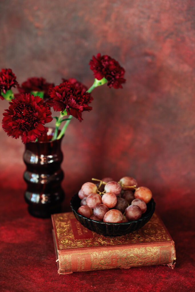
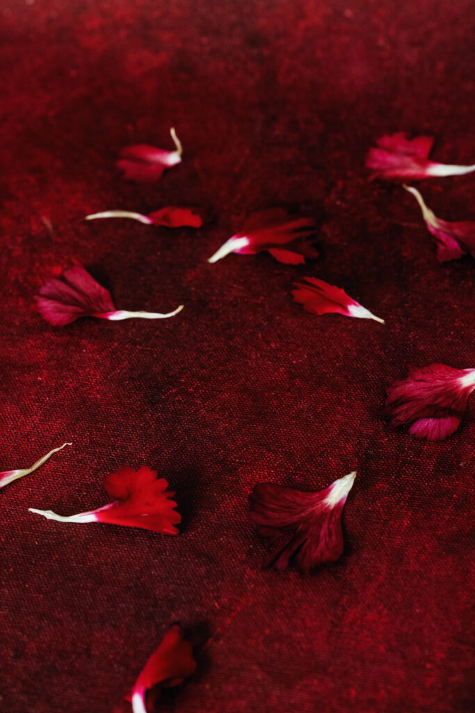
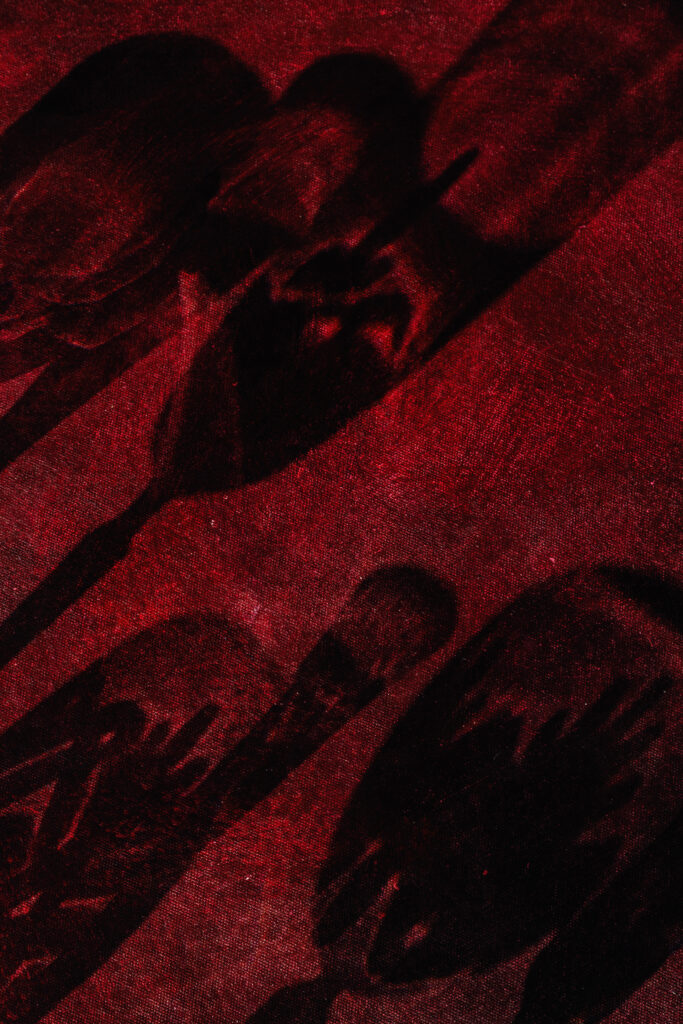
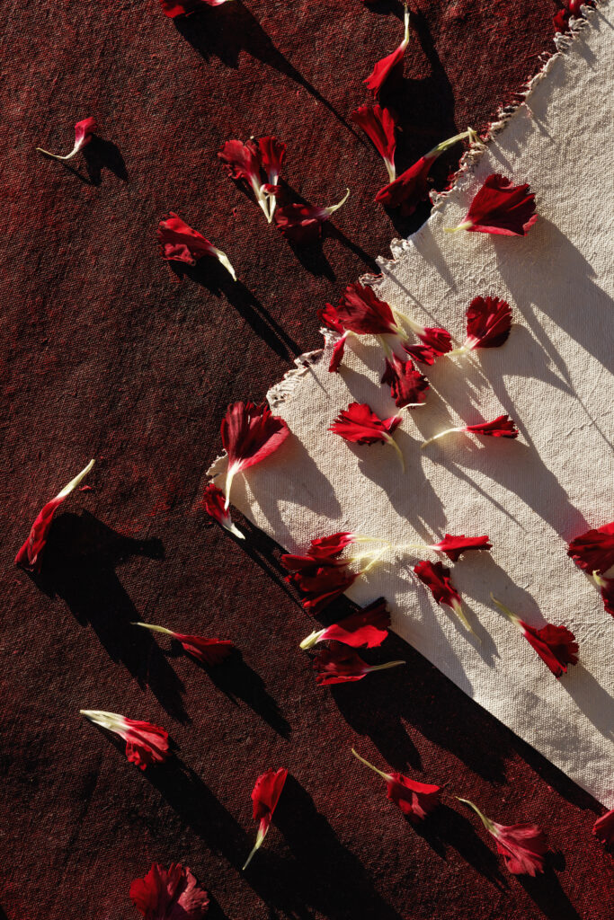
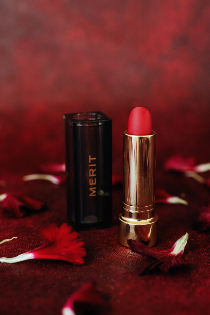
Red can be a tricky color. It’s not everyone’s first choice, but it’s a great one. When layered and textured, it transforms — from something loud to something captivating.
That’s why the Layered Deep Red Side was designed with both cool and warm tones — to balance, to move, to only elevate your styling. It pairs beautifully with neutrals, metallics, greens, and natural textures, making it perfect for:
-
Winter and holiday flatlays
-
Wedding and brand styling
-
Editorial shoots
-
Romantic or product storytelling
Photographs and styling by Rachel Clarke of Clarke Narrative
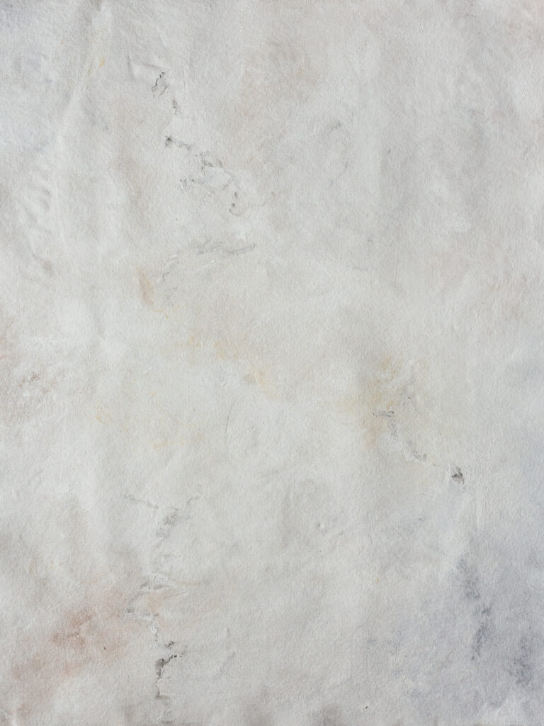
The Other Side: A Neutral You’ll Actually Use
Of course, I know how much you all love your neutrals.
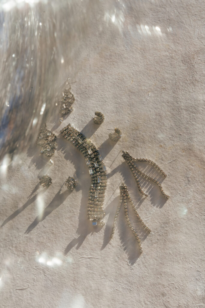
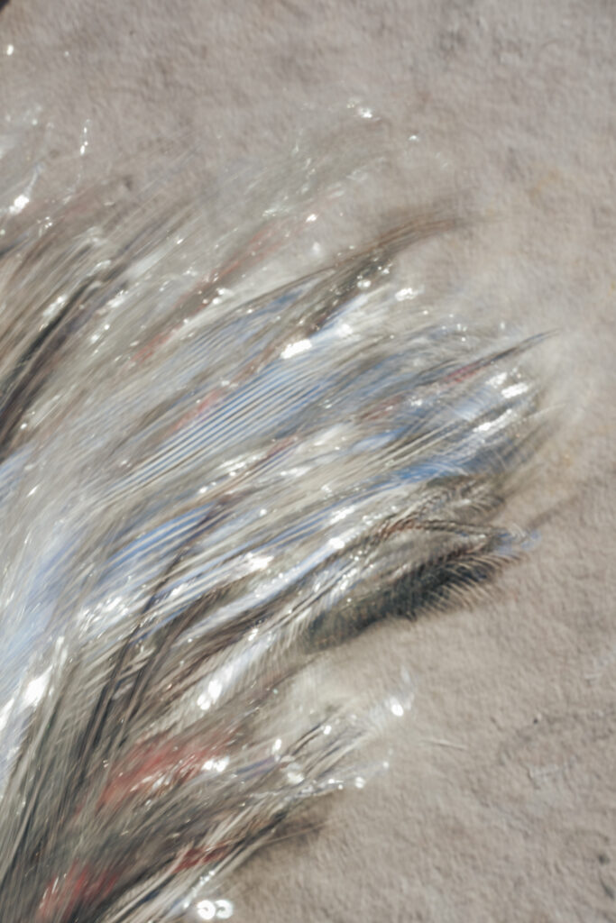
So on the reverse side, you’ll find a layered neutral base — subtle, balanced, and adaptable. It’s not just “another beige backdrop.” It’s a surface that pulls warm and cool depending on what you place on it.
If you photograph cool-toned objects, you’ll see more soft grays emerge. If your setup has warmer tones, creamy tones appear.
Basically, it’s like having two mats in one: one bold and dramatic, the other calm and grounding.
This mat gives you options without limits, designed to carry you from the holiday season through spring and beyond.
 .
.
Photographs and styling by Rachel Clarke of Clarke Narrative
Why You’ll Love This Mat
-
It’s versatile: Two distinct looks in one — red for bold storytelling, neutral for everyday use.
-
It’s season-spanning: Perfect for holiday shoots, but transitions beautifully into the new year.
-
It’s layered: Each side is artistically built with depth, so your photos have natural texture and dimension.
-
It’s for creatives: Made for stylists, photographers, and creators who want movement and meaning in every frame.
Sizes & Pricing
-
2×3 ft — $249
-
3×4 ft — $325
FAQ
Q: What’s the difference between the two sides?
A: One side features a layered deep red, designed to add bold movement and emotion to your photos. The reverse is a neutral surface that adapts to both warm and cool tones — perfect for balance and versatility.
Q: Who is this mat best for?
A: Wedding photographers, brand photographers, stylists, and product-based creatives who love experimenting with light, color, and texture.
Q: How do I use the red side without it feeling “too bold”?
A: Pair it with neutrals, metallics, or natural tones. The layering was intentionally designed to be subtle enough to complement your subject — not overpower it.
Q: Can I use this mat beyond the holiday season?
A: Absolutely. The layered red side transitions beautifully into early spring (especially with greens or blush tones), while the neutral side works year-round.
Q: When will it be available?
A: Launching Tuesday, October 21 at 9 AM EST.
This mat is about more than color — it’s about giving your work movement and emotion.
You told me what you wanted: a winter bold with a neutral to balance it.
I listened.
Now, it’s here — ready to bring warmth, romance, and creativity into your next shoot.
Photographs and styling by Rachel Clarke of Clarke Narrative
Katrina Hadnot is the artist and heart behind Lindale Studios. She hand paints styling mats and backdrops, and custom pieces for brands.
WEBSITE: www.lindalestudios.com


+ show Comments
- Hide Comments
add a comment