")
")


How to Build a Unique Brand Identity by Embracing Your Creative “Weird”…
For a long time, I thought my brand wasn’t standing out because I wasn’t doing enough.
I believed I needed to show up more, say more, or push harder to be seen. (What does “push harder” even mean?!) But no matter how much I adjusted, my brand still didn’t feel as distinct as I wanted it to. Something was missing…I had the socials, the website, and all the things…but I was holding something back that I tried to just keep to myself.
It always felt like something was just out of reach. What I didn’t realize at the time was this:
The problem wasn’t visibility. It was brand identity clarity.
Why Your Brand Feels Like It’s Blending In
On the surface, my brand looked exactly as it should. It was polished, intentional, and visually cohesive (THOSE COLORS MATTER!!!). Everything felt “right” on paper.
But underneath that, something felt off. My brand looked beautiful, and amazing, but it didn’t feel like me. There was a gap between the depth of how I saw the world and what my brand was actually communicating. I was also super shy about sharing that. I felt weird that my business was being run from different places, and even at conferences I felt weird saying I didn’t live in the US like everyone else.
I wasn’t letting my situation and the very thing that has shaped SO MUCH of how I see the world. The gap that I felt was letting my brand stay more “generic” that I would like to admit. The brand identity was little messy. Not for lack of effort, but lack of translation.
The Real Issue Isn’t Your Work — It’s Your Brand Identity Expression
What took me time to understand is that my work was never the problem. My perspective was just not fully showing up in my brand identity.
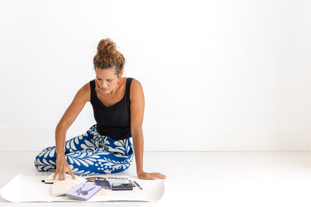
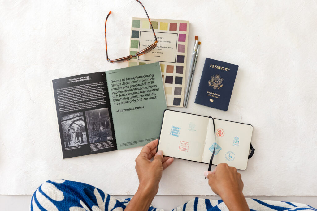
I’ve lived in different countries, built a business while raising a family, and constantly adapted to new environments. That has shaped how I see everything. It has shaped everything from how I view layouts, how I stay inspired, brush stroke directions, colors, the unique persective. But most of all, how I can interpret your story and inspiration into brand colors, styling mats, and even brand backdrops. ALL OF IT.
I notice detail, feelings that other designers might miss, and I notice a lot of things most people overlook. I care about depth, the journey, the hard and the good. I’m not really interested in the trends.
But for a long time, none of that was visible in my brand. I just didn’t feel like I could fit in with business owners. Everything looked so different for me.
Why Your Creative “Weird” Is Actually Your Brand Advantage
I used to describe this difference in me as “weird.” Actually, I didn’t. I didn’t even want to approach and step close to the idea that that was my weird. Weird isn’t good, right?
But the longer I worked in color analysis for brand colors, and creating the hand painted backdrops and styling mats for brands, the more I realized something important:
Your “weird” is often your strongest part of your brand identity. It’s literally an asset.
Because what makes a brand memorable is not how universal it is. It’s how specific it is, and how it shows up. You show up through the colors and textures, which is basically all the brand visuals. You can be specific and niche, and noticing how you can also see it in your clients is what will really set you apart.
Why Most Brand Identities Feel Generic
The disconnect I experienced came from this: My life had depth, but my brand was visually neutral.
I had brand colors, a website, offers, and a cohesive look, but it wasn’t rooted in my actual way of seeing the world. When a brand is visually “safe,” it becomes easy to blend in, even when the work itself is strong.
That is what most people experience as a lack of brand identity, not lack of skill, but lack of specific expression. A lack of taking a chance, and being bold..not being louder, but saying “I’m here: I’ve translated all of the thoughts, feelings, journals, the story, and its this…”
How Brand Identity Actually Becomes Distinct
The shift didn’t come from adding more. Instead of trying to be louder or even more polished than I was before, I started allowing my perspective to shape how my brand was expressed visually and emotionally. I just went with it. I didn’t let it consume me, but let my perspectives just shine through. I also learned to “go with my gut.”
That meant trusting:
- How I naturally see color
- How I respond to emotion and texture
- How I interpret depth over trends
This is where brand identity becomes powerful. When it reflects internal perspective and stops worrying it will fit in or not, its so much stronger, bolder, and SAYS SO MUCH MORE.
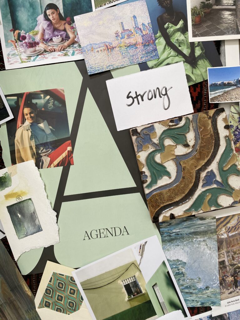
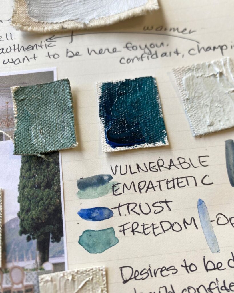
How Color Builds a Strong Brand Identity
One of the clearest shifts in my work came through color.
In branding, color is often treated as decoration, or something chosen at the end because it “looks good.” But in a strong brand identity, color is not surface level. It carries meaning, and its one of the largest pieces of your visual identity and visual foundation.
The colors you are drawn to, the combinations that feel natural to you, and the emotional response you have to them all reflect how you see the world.
When used intentionally, color becomes part of your brand language, not just your aesthetic. Don’t get me wrong, IT NEEDS to look good!
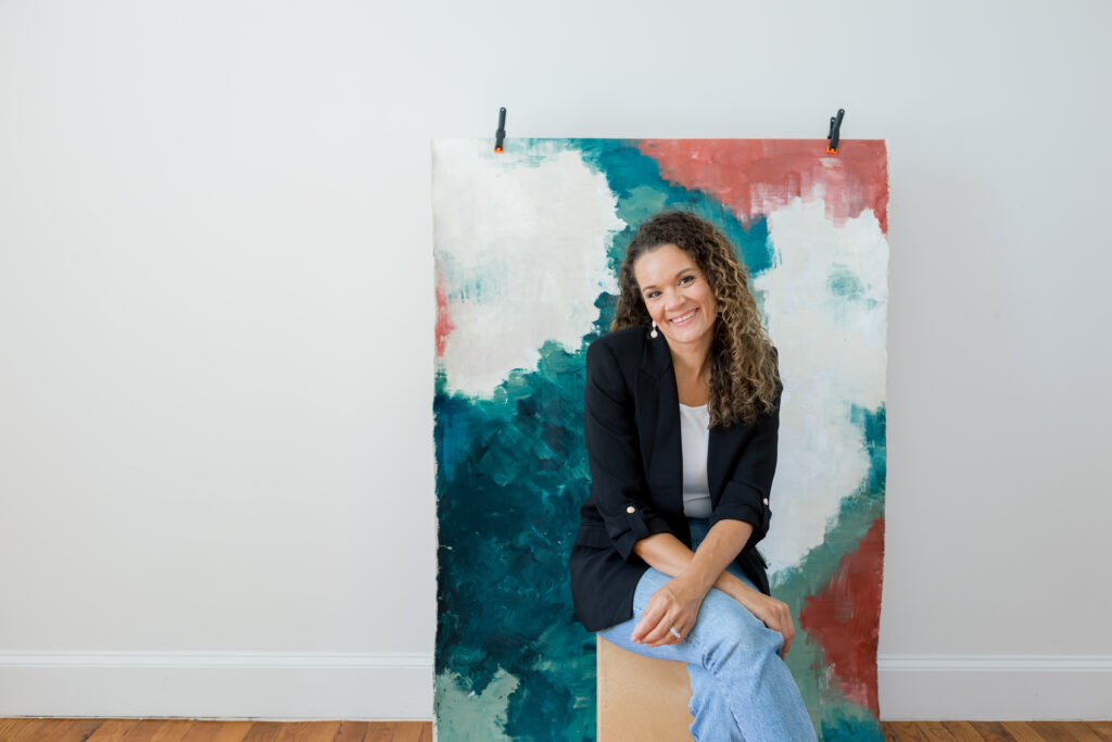
Why Hand-Painted Texture Creates a Stronger Visual Identity
This is also why hand-painted texture matters so much in my work. Hand-painted elements introduce something digital branding often removes: depth, imperfection, and human presence. That texture cannot be replicated by templates or trends because it is built through process, not repetition. This is what makes a brand feel alive.
Texture becomes part of the identity system itself. Its not just a decoration, but a back up on all the things that make you who are in the world of you business and work.
The Shift From Loud Branding to Intentional Brand Identity
Once I stopped trying to make my brand louder, everything changed. Because brand identity is not about volume, its about being able to be clear and show up consistently over time.
When that happens, people don’t just see your brand, they recognize it and remember it. Even if they can’t explain why.
What This Means for Your Brand
If your brand feels polished but still blends in, the solution is rarely “do more.”
It will translate better.
Your perspective already exists, but doesn’t your brand identity and brand visuals actually reflect it?
That is the work behind my Brand Package — creating a visual identity through custom color, hand-painted textured styling mats and backdrops, and intentional storytelling so your brand feels distinct, grounded, and recognizable.
👉 Explore the Brand Package here:
https://www.lindalestudios.com/brandpackage
Katrina Hadnot, Artist and heart behind Lindale Studios


+ show Comments
- Hide Comments
add a comment