")
")


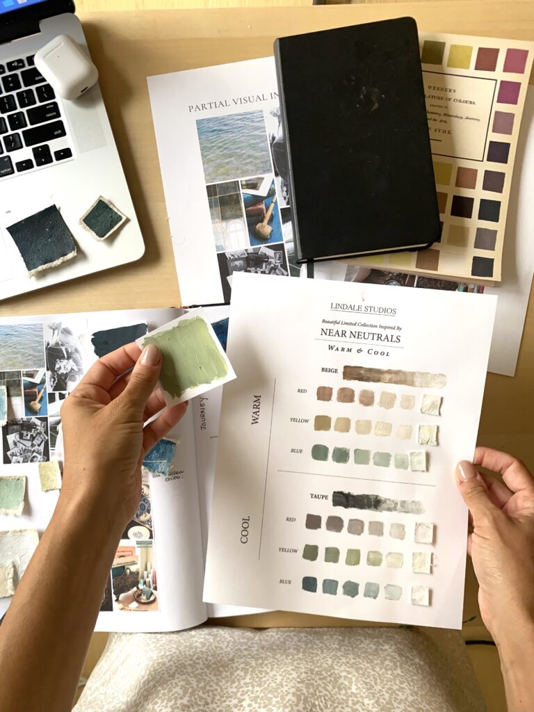
Hi there! I’m Katrina, and I’m the artist and heart behind Lindale Studios. I hand paint styling pieces for brands and stylists. I have a passion for color theory, and helping entrepreneurs see how colors can impact your brand through your journey.
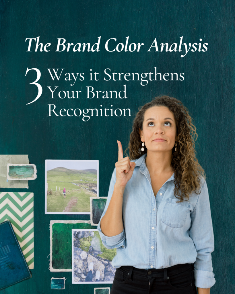
In this blog post I’m going to help you understand what the Brand Color Analysis is (quickly!) and three ways it strengthens your brand recognition.
WHAT is The Brand Color Analysis

I took a poll on social media recently, and asked business owners if they wanted potential clients to choose them for what they do, OR choose them for what they PERSONALLY bring to the table.
100% said that they wanted to be chosen for both–the service or product they offer, and what they bring personally to the table.
People are looking for a connection. They want to know the story behind your brand, not just what you do.
Let’s be honest for a second, there are other people who do what you do.
One of the biggest ways you can help a potential client see YOU, and a way for them to appreciate you is through your brand colors. Colors (tones and shades etc.) tell a story, and help bring people in, in ways that copy can’t.
(Don’t worry, COPY IS IMPORTANT, but I’m talking about color here!)
Because I’m passionate about this topic, and I saw a need for many brands who
- Didn’t have brand colors
- Wanted brand colors, but weren’t ready for a an entire rebrand.
- Needed a color analysis done for the website template.
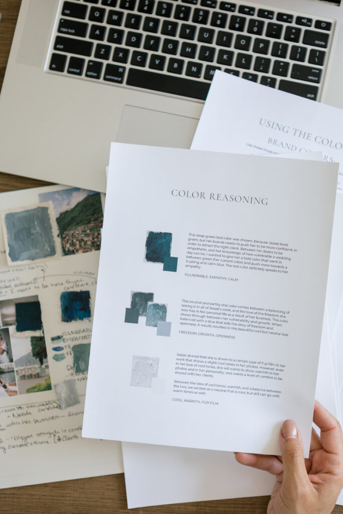
What you physically walk away with:
- 8-12 page color analysis. The what, why, and how of your new brand colors. It will include explanations, and help you understand the background. I also use the JAG combination (my own “formula” for creating brand colors!)
This all starts with a 60-minute call where I will ask you lots of questions, and you get to just share “all the things.” So much comes out of these calls!
3 Ways the Brand Color Analysis Strengthens Your Brand Recognition
1. The right brand colors speak to your business journey
Wait, I thought that colors are only supposed to speak to your target market.
Yes, but no. Let me explain.
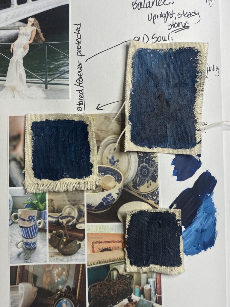
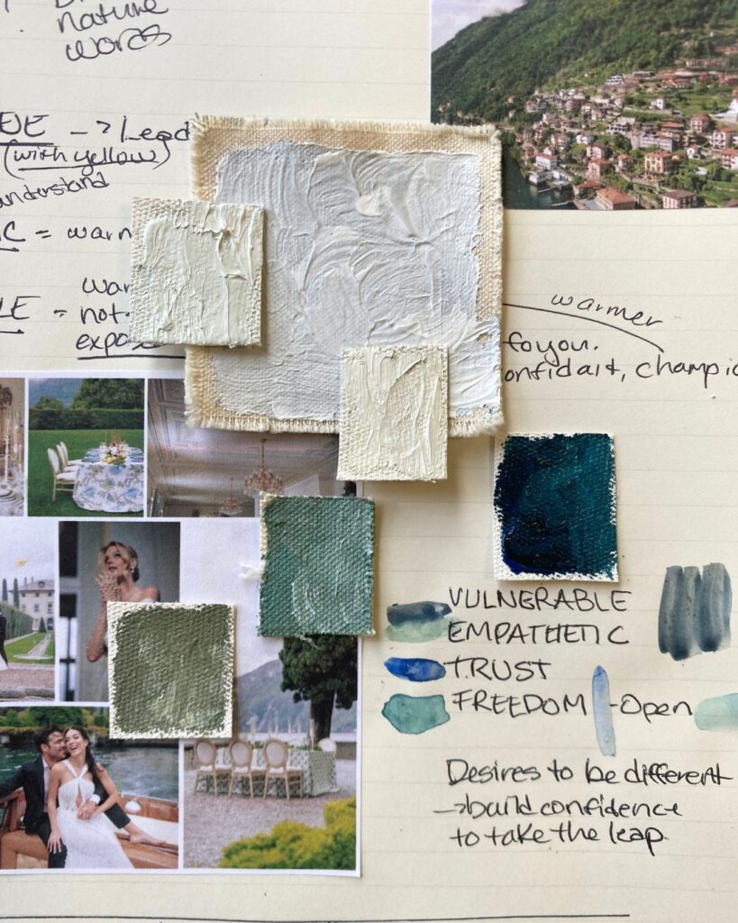
For example, let’s say you want your clients to TRUST you. Ok, yes, if that’s one of your main goals, then you might want to look at the color “blue” for your brand colors. But there are lots of different shades AND tones of blue. Navy blue, marine blue, teal blue, light blue, dark blue, gray blue–just to name a few. As I always say, it never ends. (WHICH I LOVE!)
Will your potential client notice all of these details when it comes to the color they first see?
Maybe, maybe not.
But, they will feel something. Yes, you can get them to stop and take a look at your website, and your typeface, and yes, you can get them to read your copy.
However, your brand colors are one of the first things they are going to see!
“Color is a sensation created in the brain.” – Scientific American
For some clients, they are going to have a physical feeling or perception and will either have a poor connection with them, OR some will have a great or similar connection with you. For so many of you, you desire a connection with your clients and want them to hire you for YOU, not just for what service you can provide.
If you look at your journey, what sets you apart, the good and hard of your business, and your inspiration…it should speak to your brand, because YOU ARE YOUR BRAND. ESPECIALLY, if YOUR NAME is on it!
The right brand colors represent your story–which in turn gives you….
2. It gives you confidence
I hear this again and again.
“I don’t know what to say.”
“I feel like everyone else.”
“I struggle when a client chooses another photographer.”
“I struggle with confidence.”
“Anyone can do what I do.”
“Why would someone choose me?”
You have to show up.
If you are firm in your journey, your brand colors, and your design, you can show up.
You have something to say. You can bring clients in. You can show WHY you are passionate about what you do. You can have brand colors that are a representation of you, and stand out visually.
You didn’t just start this business out of nowhere. You have reasons, trust me, they are there.
Get that confidence.
The right brand gives you confidence–which in turn helps you…create brand recognition.
3. The right brand colors create brand recognition–which gets people to remember YOU!

But wait, isn’t my work supposed to speak for itself?
Yes, BUT unless you have clients that are coming to you with all the same style, and the same color palettes, and the same EVERYTHING, how can you always be consistent in your work?
The day may come when that may be possible, but until you can get there, use those brand colors!
Use them on your website, your social media education quote backgrounds, in your logo, in your website templates, your Insta stories, your tik-toks, and use the colors in your materials.
v
In a day and age where visuals are processed 60,000 faster than text, you need to stand out with confidence in order to be seen and heard.
Reach out and let me design colors that are SHOW WHO YOU ARE.
Start the Brand Color Analysis HERE!
It’s gonna be great!


+ show Comments
- Hide Comments
add a comment