")
")


Hey there! I had been wracking my brain on what the next launch should be inspired by. My family and I travel quite a bit while we are in Europe for the next few years, and I love being inspired to look closely around me and see what new colors and textures come up in my mind!
If you are new to this blog, thank you for stopping by! I’m Katrina, an artist, creative, wife, and mom who LOVES to paint and design with her hands. I hand paint styling mats and backdrops, and am passionate about painting work that artistically enhances editorials, weddings, events, and brands. I currently live in Spain, but ship backdrops and styling mats back to the good ole’ USA often.
My newest collection is launching Tuesday, October 18, at 9 am, EST!
NEAR NEUTRALS: Warm & Cool
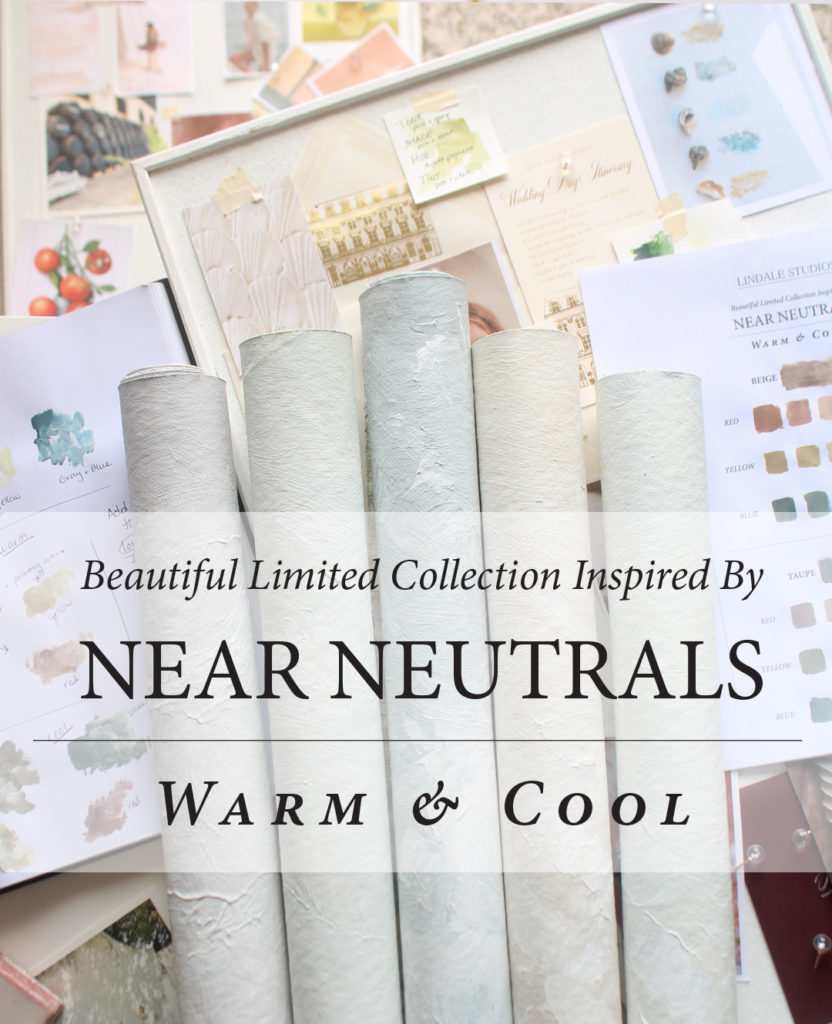
Why Neutrals?
I had been wracking my brain on what the next launch should be inspired by. My family and I travel quite a bit while we are in Europe for the next few years, and I love being inspired to look closely around me and see what new colors and textures come up in my mind!
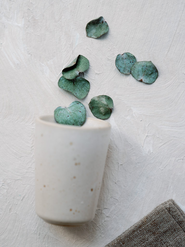
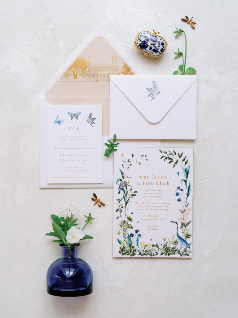
Two of the places we visited this year were London and Greece, and while we were there, I saw that there were neutrals everywhere! Now, don’t get me wrong, they looked very different. London had a refined, classic, and elegant feel, while Greece was relaxed, with bright whites, and felt like an escape. SO DIFFERENT! However, they both used creams, whites, high contrast, intense blacks, and lots of gray….neutrals!
Yes, super beautiful, BUT that doesn’t always translate to wonderful options for styling mats. My goal was to help my clients and customers choose a mat (or MATS!) with purpose and I found that I wanted to launch a neutrals collection that was purposeful, luxury, and unique. I love and am completely inspired by neutrals, but there is a reason I want to share more about them, NEAR NEUTRALS more specifically. I want my the photographers and stylists who purchase my mats to be able to shop on Tuesday, October 18th, and select the rollable styling mats that will elevate and style what they NEED. Neutrals are awesome and cover all the bases.
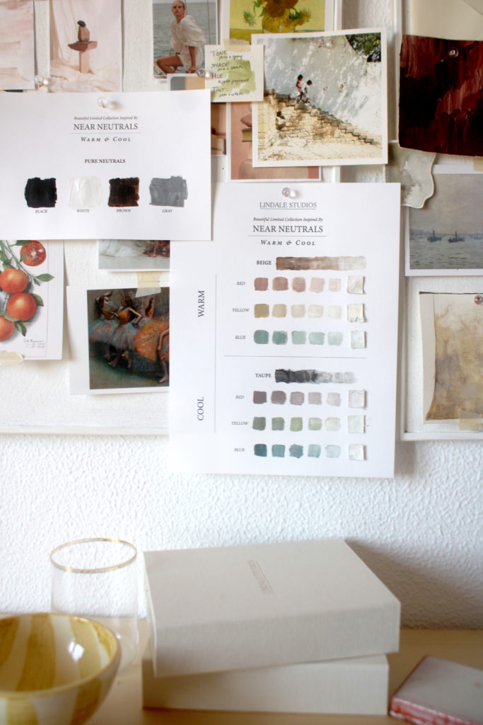
What is a Near Neutral?
Good question!
Primary color + Neutral + White
Primary color = Red, Blue, Yellow
Neutral = Black, White, Brown, Gray
In order to create a NEAR NEUTRAL you have to add a great amount of white so that it is almost white.
I wanted the styling mats to still have a little color, so thats why this collection is “INSPIRED” by Near Neutrals.
What are the options for this next launch?
I’m so glad you asked! There are 5 different styling mats to choose from. They are based on both “warm” and “cool” near neutrals.
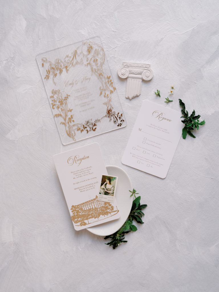
1. WARM RED
COLOR DESCRIPTION: Beige (a warm neutral “Brown variation”) + Red + White
Pairs well & accents well with: Greens, teals
WHY? Greens and Teals are the complimentary color of red (the primary color used) on the color wheel
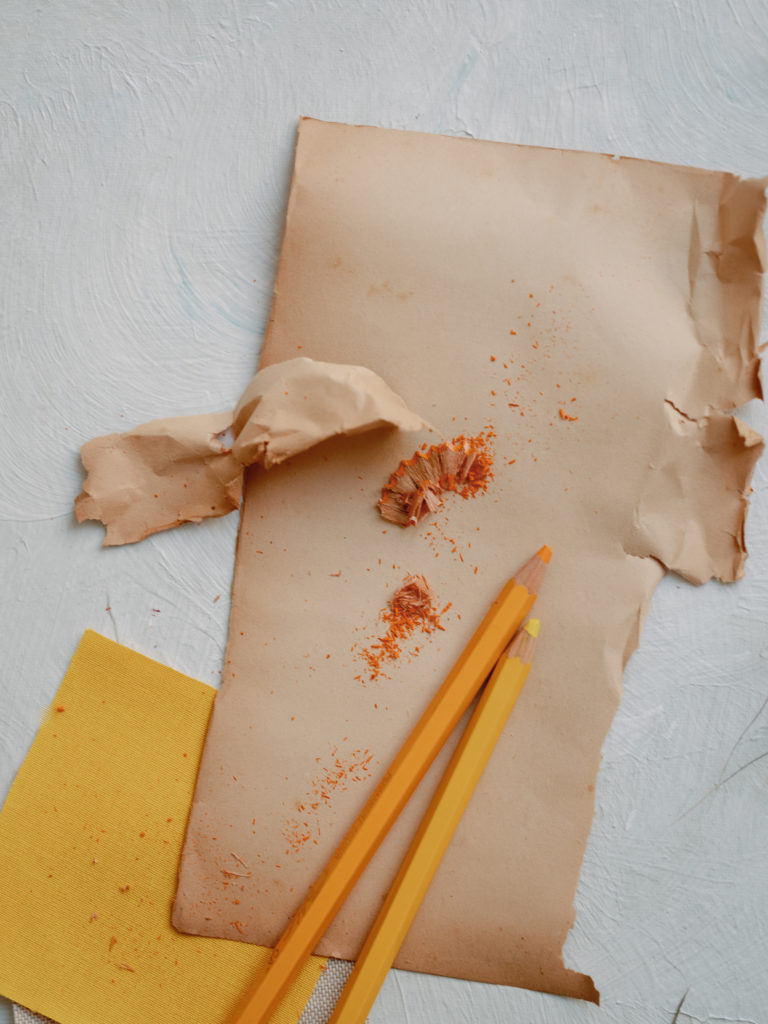
2. WARM YELLOW
COLOR DESCRIPTION: Beige (a Warm neutral “Brown variation”) + Yellow + White
Pairs well & accents well with: Blues, Purples
WHY? Blues and purples are the complimentary color of yellow (the primary color used) on the color wheel
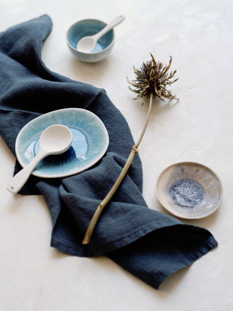
3. WARM BLUE
COLOR DESCRIPTION: Beige (a Warm neutral “Brown variation”) + Blue + White
Pairs well & accents well with: Blues, Purples
WHY? Oranges, and yellows are the complimentary color of blue (the primary color used) on the color wheel
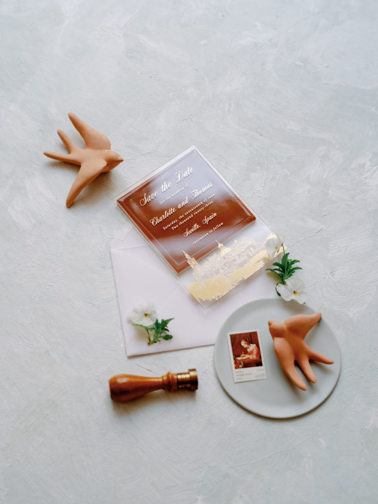
4. COOL RED
COLOR DESCRIPTION: Taupe (a Cool neutral “Brown variation”) + Red + White
Pairs well & accents well with: Greens, and teals
WHY? Greens, and teals are the complimentary color of red (the primary color used) on the color wheel

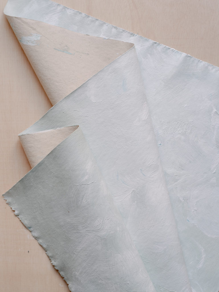
4. COOL BLUE
COLOR DESCRIPTION: Taupe (a Cool neutral “Brown variation”) + Blue + White
Pairs well & accents well with: Oranges
WHY? Oranges, and yellows are the complimentary colors of blue (the primary color used) on the color wheel
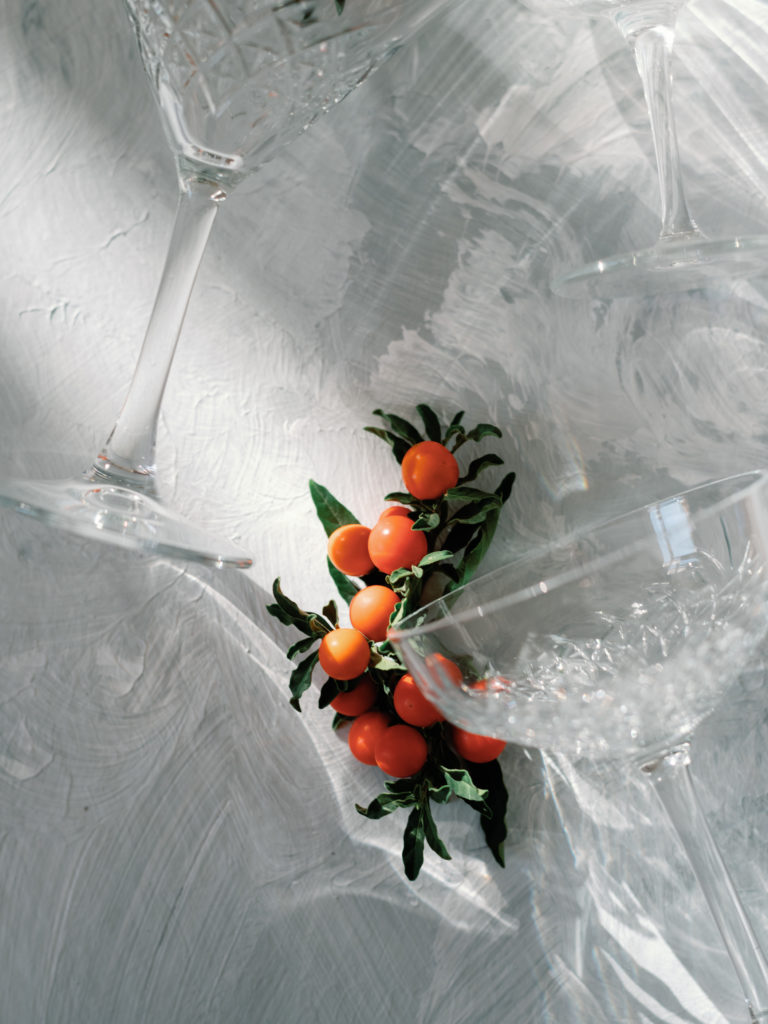
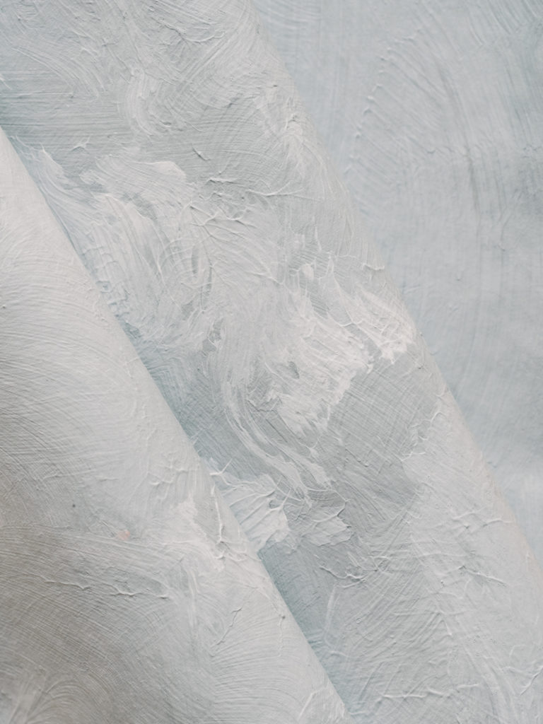
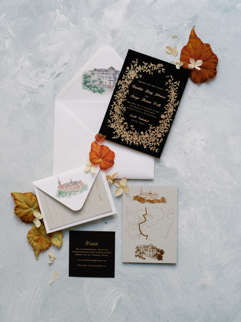
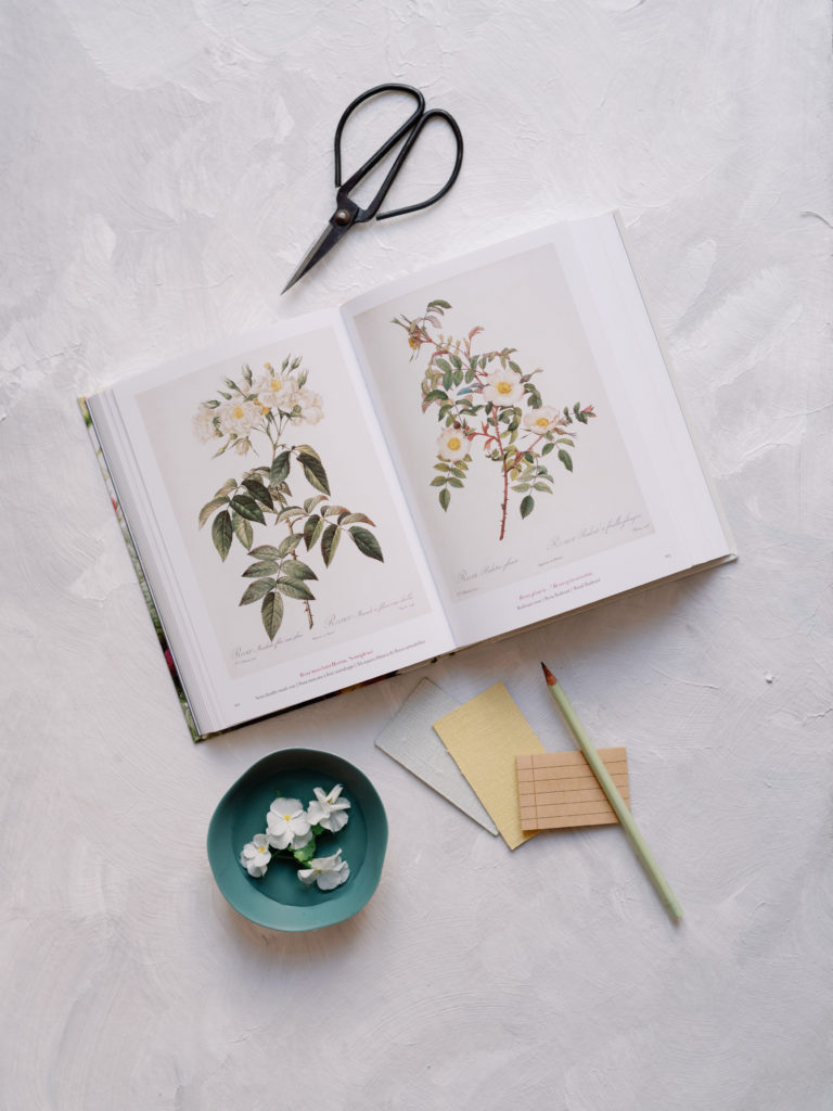
Flat Lays Phtoography and Styled by Branco Prata & Branco Prata Studios
What do you think? No more “which one should I buy? They are all so pretty!” Grab a mat with confidence and get ready to style with colors that go together.
No more guessing. Sounds good?
Awesome! Keep following along ✨
Sign up here for our email list, and following for the next launch of October 18, at 9 am EST!


+ show Comments
- Hide Comments
add a comment